
Pitch deck, slides, or visual aids, whatever your company calls it, it’s necessary documentation to have. Every company needs some form of content to gather partners or to get clients. If you’ve ever watched a startup founder nervously shuffle through their slides in front of a room full of investors, you know how much rides on being properly prepared. A business deck is far more than a collection of slides; it’s your company’s story compressed into a handful of minutes—a meticulously crafted narrative designed to unlock opportunities and spark curiosity in investors, partners, or even competition judges.
In this short, but straightforward-guide, we’ll break down what a business deck is, why it matters, the key slides you need, and the best practices that separate winning decks from the forgettable ones. Plus, we’ll show how modern tools like Aurora Slides can take your deck from “meh” to memorable.
What is a Business Slide Deck?
At its core, it’s a concise presentation that offers a clear overview of your business idea, its potential, and your plan for execution. Whether you call it investor decks, business decks, slides, or company presentations, the goal is the same: get your audience excited to learn more.
What’s unique about this visual document is that it isn’t a business plan—it’s a teaser, not a textbook. You’re giving just enough information to intrigue and persuade, not to explain every detail. And here’s the truth: your pitch isn’t set in stone the moment you finish it. In fact, many founders see their pitch slides as an evolving, “living” document—constantly adapting with every bit of feedback, team change, and business pivot.
One founder summed up this reality perfectly in a Reddit thread responding to “How long did it take you to perfect your pitch and pitch deck?”:
“….I believe pitch decks are a living document.
Since I started, I’ve updated it whenever co-founders or team members left, or as we received feedback and pivoted. I also kept tweaking the value proposition.
To me, it was never truly finished.
I continuously updated the design, creating one smaller (5 slide) pitch deck for initial email pitches and a more detailed 10-slide pitch deck for pitching to VCs and angels. I also had a 1 page executive summary that I included in the email I sent to investors.
For the 10 page slide deck, I also prepared backup slides with financials, projections, and other materials to address any potential objections from investors.
I raised investment three times from angels for my startup. Hope this helps…” – aredoblado •• Edited
This highlights an important mindset: don’t stress about achieving a “perfect” business slide deck on your first attempt. Treat it as a tool that grows and adapts with your startup, just as you do. The best slides are the ones that evolve alongside your business journey. When it comes to the different types of documents, and the names everyone give them, I recommend you reading this blog about Pitch Deck vs Executive Summary to see the differences and examples.
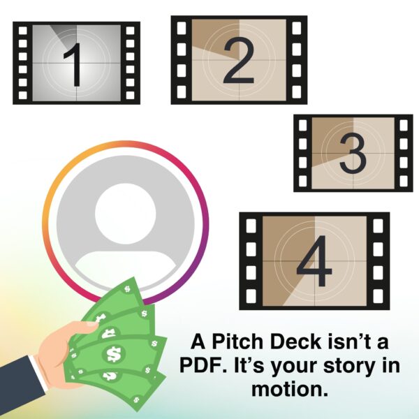
Analogy: The Pitch Slides as Your “Movie Trailer”
Imagine you’re at the movies. The lights dim, and a trailer for a new blockbuster comes on. In two minutes, that trailer has to hook you—give you the plot, show off the stars, hint at the drama, and make you want to buy a ticket.
Your deck is your startup’s trailer. You only have a few minutes to pitch, and if your deck is confusing or dull, your “audience” (investors) will tune out before the good part even starts. Like a great trailer, a great deck is all about clarity, emotional hooks, and leaving them wanting more.
Who Needs this File Handy?
If you’re a startup founder, small business owner, or entrepreneur, you do. Product slides aren’t just for Silicon Valley unicorns—they’re used everywhere. Whether you’re raising your first round, applying to an accelerator, courting strategic partners, or entering a competition, you’ll need a deck that works.
But here’s the catch: investors, on average, spend less than 4 minutes reviewing a pitch deck. That’s less time than it takes to make a cup of coffee. Your first impression is everything.
Real-life anecdote: I once watched a founder breeze through 20 slides in five minutes—too fast for anyone to absorb the message. The investors never asked a single question. The lesson? Less is more.
Pitch Slides Structure – The Key Slides
A winning business deck isn’t just a stack of pretty slides. Each slide plays a role in your story. As emphasized in “The Ultimate Pitch Deck Guide – 2025,” your deck should answer four core questions: What opportunity have you discovered? What is your company building to solve it? How big is the growth potential? And why is your team best suited to win? Each section should be concise, visual, and designed to hook investors fast—remember, most investors spend less than 4 minutes reviewing a deck!
We’ll be using a template from Pitch to show you some visual examples. Here’s what you need: don’t skip any!
Cover Slide or Title Slide
This is your handshake. It should have your company name, a memorable tagline, logo, and contact info.
Pro Tip: Add a quick explainer (5–7 words) of what your company does—think of it as your elevator pitch in a sentence. According to the video guide, founders often spend too long brainstorming this line, but that’s okay—test it with strangers and see if they “get it” instantly.
Visual: A nice well-designed cover slide.
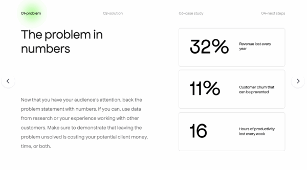
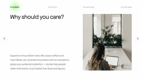
Problem Statement
Spell out the pain point. What problem are you solving, and why does it matter? Make it urgent. The best problem slides use short, fact-based lines (not opinions), and can be backed by data or a market trend. In the video, the Airbnb and Uber decks are highlighted as perfect models: each line is clear, indisputable, and takes seconds to absorb.
Pro Tip: If your business is opportunity-driven (not pain-driven), focus on why now is the moment for your solution.
Visual: Real-world problem slide.
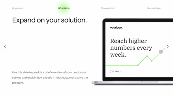
Solution/Product
How does your offering resolve the problem? Keep it crisp and visual.
Best Practice: The solution slide should directly answer each pain point from the Problem Slide. The Airbnb deck, for example, had a line-by-line match between problems and solutions.
Visual Opportunity: Use product screenshots, diagrams, or before/after graphics to make your solution real and tangible.
Market Size & Opportunity
Explain the market size. Show the size of the opportunity—TAM (Total Addressable Market), SAM (Serviceable Available Market), SOM (Serviceable Obtainable Market). Use charts.
From the video: Avoid “top-down” estimates like “If we capture 1% of a $1B market…” Instead, show how you’ll reach customers and what share is realistically attainable (“bottom-up” approach).
Pro Tip: Use an objective, data-driven summary, and cite your sources.
Visual: Market size illustration and current company numbers.
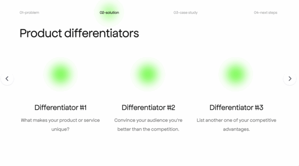
Competition & Competitive Advantage
Who else is out there, and what’s your edge? Use tables or charts for this section. It helps viewers measure the or reduce the risk related to your idea.
Actionable Advice: Never say you “have no competition”—this is a red flag. Instead, show how you’re different, whether it’s technology, speed, pricing, or customer experience.
Pro Tip from the video: Don’t just list competitors; show your unique positioning and why your moat will last.
Visual: Competitive matrix.
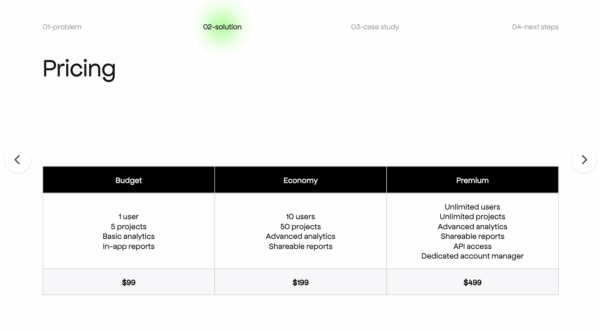
Business Model
How do you make money? What’s your revenue engine? This slide should provide a clear explanation of your business model.
Best Practice: Be simple and direct: Is it a subscription? Usage-based? Commission? Include pricing if possible.
From the video: Don’t try to run every forecast—just state how your business captures value.
Visual: Revenue streams diagram.
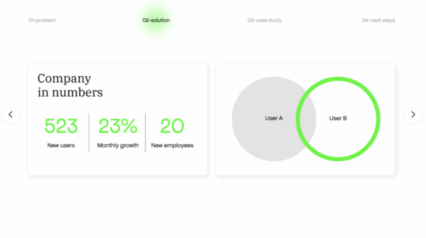
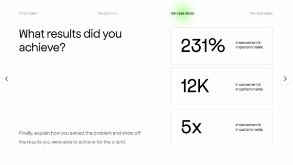
Traction
Show your wins: users, revenue, partnerships. Numbers talk. GoHire.reminds us that:
“A study by Startup Genome found that 70% of startups fail due to premature scaling, making traction a vital metric for investors.”
Video Advice: If you have early revenue, user growth, or big-name customers, make this slide prominent. If not, highlight milestones like user signups, pilots, or waitlists.
Pro Tip: If you’re pre-traction, use a “validation” slide (like waitlists or surveys) to prove demand.
Visual: Traction timeline or key metrics chart.
Team
Who’s behind this? Highlight founders and key people in the company.
From the video guide: At the early stage, investors are betting more on the team than the idea. Clearly state why you (and your co-founders) are uniquely equipped to solve this challenge. Mention relevant experience, grit, and any “secrets” or insights you hold about the market.
Visual: Team headshots, short bios, and LinkedIn links.

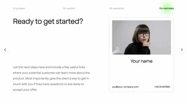
Financials & The Ask
High-level forecasts, what you’re raising, and how you’ll use the funds. Alejandro Cremades explains it better:
“Hands down this is the #1 most important piece of information from the slides you need in your pitch slides. Investors spend over 23% of the review time on this single slide so you want to clearly describe your numbers.”
Best Practices:
- Keep financials simple: show 3–5 year projections, major revenue/cost drivers, and key assumptions.
- Be transparent about how much you’re raising, what it will be spent on, and expected milestones.
- From the video: Always have backup slides for deeper financials, projections, and FAQs—be ready to address any objections.
Visual: Financial summary table or “use of funds” pie chart. Leave a call to action slide where you’ll add something inspirational.
Final Tips from The Ultimate Pitch Deck Guide 2025:
- Each slide should answer one core question and move the story forward.
- Use clean, visual slides with one key message per slide.
- Practice your narrative—don’t just read the slides.
- Tailor your deck for each audience and always be ready to adapt.
- If you’d like to see more templates or download pitch decks ready to use, visit Pitch here.
Watch the full video here: The Ultimate Pitch Deck Guide – 2025
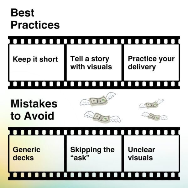
Best Practices for a Winning Business Deck
- Keep it short—aim for 10-12 slides, 15 max.
- Tailor your deck to your audience: investor, partner, or competition. This is a reality we all need to understand about our decks.
“Buyers don’t care about your company’s history; they care about how you can solve their problems. Structure your deck around the challenges your audience faces and demonstrate how your product delivers results.”
- Use visuals, not walls of text.
- Tell a story: introduce the problem, build tension, present your solution, and end with a call to action.
- Practice your delivery—it’s not just what’s on the slides, but how you present them.
“Keep it short.
Use more visuals.
Tell a story.
Make it look beautiful.”
Common Mistakes to Avoid
- Info overload: Don’t try to explain everything—leave room for questions. This is called Purposeful use of information.
- Generic decks: Customize for your audience.
- Skipping “the ask”: Be clear about what you want.
- Unclear visuals: Every slide should have a point.
- Not practicing: Even the best deck falls flat if the pitch is unpolished.
- Relying too much on design. What great design can’t cover up?
“A weak understanding of your market
An unrealistic go-to-market plan
Misaligned priorities
Vanity metrics that mask deeper issues”
How To Transform Your Pitch Deck Creation
Building a investor deck from scratch can be a daunting process, but Aurora Slides changes the game. As your AI-powered, design-savvy partner, Aurora Slides streamlines every step—from brainstorming to final delivery—making it easier than ever to craft a presentation that stands out. Here’s how Aurora Slides transforms the experience:
|
Feature
|
What It Means for You
|
|---|---|
|
Dynamic storytelling
|
Just drop in your notes, bullet points, or even meeting transcripts—Aurora Slides crafts a polished, audience-ready deck in minutes.
|
|
Professional, flexible templates
|
No design skills? No problem. Aurora Slides offers a library of stunning layouts for every scenario.
|
|
Smart content mapping
|
Aurora organizes and prioritizes your info, so your story flows and your key points shine.
|
|
Conversational editing
|
Want to split a slide, change the tone, or add a graph? Just chat with Aurora and watch your deck update in real time.
|
|
Adaptive layouts
|
Switch formats on the fly—Aurora remaps everything for you.
|
|
Collaboration and sharing
|
Share instantly with public links, manage permissions, and work with your team seamlessly.
|
|
Real-world impact
|
Founders have saved hours (and their sanity) prepping for investor meetings with Aurora Slides.
|
Learn more about how Aurora Slides redefines business storytelling with its capability to summarize with intelligence.
Takeaways & Action Steps
- Start with the essentials: cover, problem, solution, market, competition, business model, traction, team, financials, and ask.
- Keep it visual, concise, and tailored to your audience.
- Use tools like Aurora Slides to save time and deliver with confidence.
- Ready to learn more about AI and decks? Visit our Learning Vault here!
Frequently Asked Questions (FAQs)
What’s the ideal length for a pitch deck?
A: 10-12 slides, 15 max—short, sharp, and focused.
Should I use a template or start from scratch?
A: Templates (like those in Aurora Slides) help, but always tailor to your story.
How do I tailor my pitch deck for different audiences?
A: Highlight what matters most to each audience—investors care about growth, partners about synergy, judges about impact.
Can Aurora Slides help me customize my deck for different investor meetings?
A: Absolutely. Aurora Slides makes it easy to adapt your pitch for each audience by allowing you to quickly edit, rearrange, or duplicate slides and tailor messaging for different investor priorities.
Do I need design experience to use Aurora Slides?
A: Not at all! Aurora Slides is built for everyone—from first-time founders to seasoned execs. Its intuitive interface and professionally designed templates mean your deck will look polished and on-brand, no matter your design background.
Ready to make your next pitch deck unforgettable?
A: Get started with Aurora and put your best story forward.