
Deck writing of the “humble deck” has evolved. It went from a handful of slides to one of the most powerful communication tools in modern business. Whether you’re pitching investors, aligning your team, or convincing a client, your deck is often the first, and sometimes only, impression you get to make. A well-written deck can be the difference between “let’s talk” and “no thanks.” As digital communication accelerates, the ability to synthesize ideas visually and persuasively is only getting more critical.
At Aurora, we like to stay up to date with the latest trends and technology. Visit our Learning Vault to find more topics related to AI and its present application in your day-to-day.
But great decks production isn’t just about pretty slides. It’s about telling a clear story, making a compelling argument, and guiding your audience to act. In this guide, you’ll learn not only the “what” of deck writing, but the “how”—with concrete templates, strategies, and expert-backed tips that work in the real world.

What Is Deck Writing?
Before diving into frameworks and slide-by-slide breakdowns, let’s get on the same page about what “deck writing” really means—and why it’s so much more than just making slides look good.
At its core, decks production is a form of art—part storytelling, part design, part strategy. Much like a painter uses color and composition to evoke emotion, a great deck writer arranges words, visuals, and flow to inform, persuade, and inspire action. Every deck is its own creative canvas, where structure and narrative come together to achieve a specific purpose.
While the classic pitch deck reigns in the startup world, the art of pitch writing now powers everything from sales presentations and creative proposals to internal project updates and more. And thanks to AI-powered tools, the “brushes” and “paints” of this art form are more accessible than ever—making it possible for anyone, regardless of design background, to try their luck and craft a compelling story.
In other words: crafting decks is no longer reserved for professional designers or seasoned founders. With the right approach and tools, anyone can communicate ideas, build alignment, and move audiences.
Here are some of the main types of decks you’ll encounter, depending on your goal and audience:
| Deck Type | Purpose | Audience |
| Pitch Deck | Fundraising, partnership, or recruitment pitches | Investors, partners |
| Sales Deck | Convert prospects, product demos, client onboarding | Clients, buyers |
| Creative Deck | Propose ideas, showcase vision, campaign, brand, or design | Agencies, brands |
| Internal Deck | Align, update, plan, status updates, roadmaps, retrospectives | Teams, leadership |
Real-world perspective:
A product manager at a SaaS company might use one deck format to motivate their engineering team at a weekly standup—and a completely different structure, tone, and narrative style to pitch a new feature to executives or external customers. Deck writing is about flexing your story and delivery for the audience and the outcome you want.
The Strategic Foundations of Deck Writing
Now that you know what qualifies as a deck and why it matters, let’s explore the foundational principles that make some decks resonate while others flop. If you want your message to stick, you have to start with strategy. For more detailed information, check out our pitch deck essentials blog.
Audience-Centric Writing
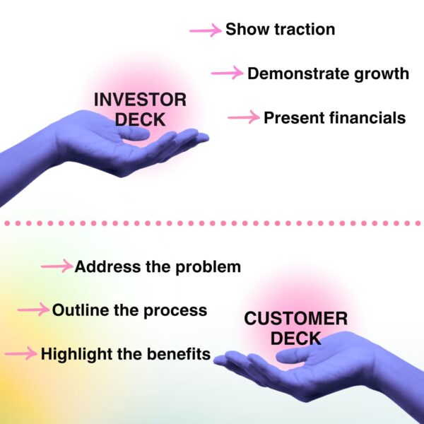
Great decks aren’t built in a vacuum. They’re built by understanding what your audience cares about, what they already know, and what you want them to believe after reading your deck. Tailoring your message to these answers drives engagement. You need to adapt it to different scenarios as well, read the room, take into account the context; are you merging your company? Are in a pivotal moment? What do the attendees care about?, are there other stakeholders?
Here’s an Example a two different audiences:
- Investor version: “Here’s our traction and growth curve.”
- Customer version: “Here’s how we solve your pain, step by step.”
The Power of Storytelling
Facts alone rarely win hearts—or funding. The most memorable pitch decks use story to build an emotional connection, making your message 22 times more memorable than data alone. Instead of just listing features, guide your audience through a narrative: highlight a real problem, show your solution, and paint a picture of the impact.
Whether you tell the founder’s journey, a customer’s transformation, or an industry shift, stories help investors see why your company matters right now and why you’re the team to make it happen. As storytelling expert Alejandro Cremades puts it,
“Storytelling truly allows your pitch deck to really communicate and connect with your audience on the issues that truly matter to them.”
One of the most actionable resources on this topic is the video “How To Improve Storytelling In A Pitch Deck.” The video emphasizes that storytelling isn’t just an add-on—it’s the core of your pitch. Viewers learn that you must make investors feel part of your journey: share the “why” behind your business, use real-life anecdotes, and inspire action with emotional connection.
The speaker, Alejandro Cremades, highlights how a well-told story can set you apart, even making your financials more compelling by weaving them into the narrative. And, it’s not just about the founder or the numbers—the team’s story, your vision for the future, and the culture you’re building all play roles in making your pitch deck memorable and persuasive.
Watch the full video here.
The Anatomy of a Winning Deck
Once you’ve mapped your audience and strategy, it’s time to build your deck slide by slide. Each section of your deck plays a role in the overall narrative – let’s break it down.
Essential Slides and Their Purpose
Every strong deck should include these key slides:
| Slide Name | Purpose / Key Questions Answered | Audience Reaction |
| Cover | Sets the tone, introduces your company, tagline, and contact info. | “Who are you and what do you do?” |
| Problem | Defines the pain point. What’s the problem? Who experiences it? How do you know it’s real (data/research)? | “That’s true! I see why this matters.” |
| Solution | Shows how you solve the problem. What’s your solution? Why is it better than alternatives? What are the finished-story benefits? | “Interesting—how do you do this better?” |
| Product | Demos your product/service. How does it work? How does it deliver value? What’s unique? | “I get what you’re actually offering.” |
| Traction | Validates your solution. How many users/customers? Revenue, growth, partnerships, testimonials? | “Wow, real progress—there’s demand!” |
| Market | Illustrates the market opportunity. How big is the market (TAM/SAM/SOM)? Who’s your ICP/early adopter? LTV, CAC, churn? | “Is this opportunity worth pursuing?” |
| Competitive Analysis | Shows your position and differentiation. Who are your competitors? What’s your ‘secret sauce’? How do you defend/grow your market share? | “Why are you better than others?” |
| Business Model | Explains how you make money. What’s your revenue model? Has it been validated (experiments/case studies)? | “Can this scale? Is it de-risked?” |
| Go-To-Market Strategy | How will you reach and acquire customers? Which channels? What’s been validated? Distribution strategy? | “How will you actually get users?” |
| Ask + Financials | States your funding request, use of proceeds, and projections. How much are you raising? What’s your runway/burn/capital allocation? CAC/LTV? Financial forecast? | “What do you need from me, and why?” |
| Team | Explains why your team can win. Who are the founders and advisors? Relevant skills and past experience? Team cohesion? | “Can this group really deliver?” |
| Vision / Closing | Reinforces your big-picture mission and motivation. What’s your vision? Why are you driven to achieve it? | “I believe in this—and in you.” |
It’s also worth noting many professionals sometimes confuse a pitch deck with vs executive summary. In short a pitch deck will always be a pitch, the purpose being convincing the audience about your vision and your exc. summary is simply a summary of more high-level plans regarding your business.
Writing Effective Slide Content
It’s not just what slides you include, but how you write them. Here’s how to make every word count:
- Keep it concise: Use the 5×5 or 7×7 rule (max 5–7 bullets, 5–7 words each).
- One idea per slide: Don’t overwhelm.
- Active voice: “We doubled revenue” beats “Revenue was doubled.”
- Slides aren’t scripts: Use them as cues, not full paragraphs. No more than five lines per slide.
Good vs. Bad Example:
- Bad: “Our product is great because it is fast, reliable, and easy to use, which makes it better than the competition.”
- Good: “Faster. Simpler. Proven.” (Big, bold, and specific.)
Visuals stick better than words or complicated processes. Use the “Picture Superiority Effect” to make your message memorable. As a matter of fact, humans are extremely visual:
“… studies have shown that audiences will remember an image paired with a verbal cue 55% better than a verbal cue alone”
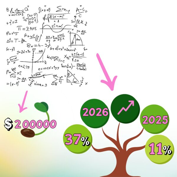
Below is a visual example of where your head should be at when trying to explain your thought process; specially if it includes percentages or projections:
Design Principles for Deck Writers
Now that you know what to say, let’s talk about how it looks. Design isn’t just decoration – it’s a delivery system for your message. A beautifully designed deck makes your story easier to follow and much harder to forget.
Simplicity, Hierarchy, and White Space
Simple design equals better understanding. Use headlines – not titles – for hierarchy. Keep details small, and embrace white space. Consistent alignment helps guide the eye.
A side-by-side of a cluttered slide and a clean, focused one illustrates the difference. Many times, empty space on the slide will enhance the reading experience. Put it this way: “White space isn’t empty—it’s breathing room for your message.”
Color, Typography, and Imagery
Once your slides are organized, color, font, and images bring the final polish. These choices matter more than you think for audience engagement and clarity.
- Stick to 2–3 main colors, using contrast for emphasis.
- Visual Pacing is super important since all your slides can’t look the same. VerdanaBold describes it as:
“…a delicate balance between visual interest and overdesign. Your goal isn’t to make every slide totally unique. Instead, you should create a few slide types, and vary those according to your content.”
- Choose easy-to-read fonts—consistency over novelty.
- Use high-quality, relevant images; skip the clichés.
- And don’t forget accessibility—choose color combinations that everyone can read. Actually it’s recommended you:
“Practice with someone who has never seen your presentation. Ask them for honest feedback about colors, content and any effects or graphic images you’ve included.”
- Along the lines of visuals, Silicon Valley Bank recommends you make the effort to actually showcase what you’re selling:
“You’ll have a huge advantage if you can demonstrate your product.”

Templates, Tools, and Modern Aids
You’ve got your message and your design; now, how do you actually build your deck? Let’s look at the best tools and how to make the most out of templates without becoming a clone.
Choosing the Right Deck Writing Tool
There are more options than ever for building decks:
- PowerPoint: The feature-rich classic.
- Google Slides: Real-time, web-based collaboration.
- Canva: Design-first for beautiful, quick slides. You have a lot more design options vs PowerPoint, that’s for sure.
- Beautiful.ai, Pitch, Gamma: AI-powered, template-rich newcomers.
- Aurora Slides: AI-driven storytelling that turns messy notes and ideas into polished, persuasive decks—ideal for anyone who wants a fast, professional result, even without design experience.
| Tool | Best For | Standout Feature |
| PowerPoint | Deep customization | Advanced animations |
| Canva | Quick, pretty slides | Built-in stock photos |
| Pitch | Startups & teams | Live collaboration |
| Aurora Slides | AI-powered decks, fast turnaround, anyone (not just designers) | Turns unstructured content into clear, branded slides with real-time, conversational editing |
Teams often use Google Slides for speed, then polish in PowerPoint for big meetings, but nowadays there are plenty of PowerPoint alternatives. Aurora Slides brings the next level—combining AI, design, and collaboration for modern, standout presentations.
Leveraging Templates
Templates can be a lifesaver when you need to get started quickly or want to ensure a clean, professional structure. They provide a framework that takes care of layout, spacing, and overall design, so you can focus on what matters most: your content and your message. In fact, using templates allows users to focus their energy in the contents and not in the design—which is always great when you’re under a deadline or just starting out.
But here’s the catch: while templates offer efficiency, they can also lead to bland, cookie-cutter presentations if you never move beyond the default settings. If every deck looks and sounds the same, your message risks getting lost in the noise. The real power of a template is as a launchpad, not a finish line.
To strike the right balance:
- Use templates for structure, but always customize colors, fonts, and visuals to fit your brand and message.
- Swap out generic icons and stock images for ones that feel specific to your story or audience.
- Adjust slide layouts as needed to suit the flow of your narrative.
A simple visual transformation—a generic template turned into a branded deck – shows how even a small effort makes your presentation feel unique and memorable. This is where tools like Aurora Slides and Canva really shine: they give you a polished starting point, then make it easy to infuse your own style and personality.
Remember, templates should save you time—not flatten your story or your voice…
Redefining Deck Writing
This tool isn’t just another deck builder; it’s like having a savvy communications coach and a pro designer rolled into one. Instead of static templates, Aurora Slides uses AI-powered storytelling to analyze your content and build a logical, persuasive flow that connects with real audiences. Instantly generate on-brand, professional decks with designer templates, and use conversational editing to rephrase or reorganize slides in real time—just chat with the AI, and your deck updates on the fly.
You can also take advantage of adaptive layouts, allowing you to switch formats or remap your content without breaking your story. Collaboration and sharing are built in, so whether you’re working solo or with a team, you can review, edit, and share decks seamlessly—no more endless email threads or version confusion.
But where does Aurora Slides really shine? It’s perfect when you need to organize ideas fast, adapt to feedback, or impress a tough audience with minimal hassle. For example:
- Internal updates: Quickly turn raw notes into polished briefings for your team or leadership.
- Sales call summaries: Capture insights from a meeting and turn them into a follow-up deck the same day.
- Project plans: Lay out deliverables, timelines, and responsibilities with clarity and style.
- Client pitches: Start with a rough outline and finish with a deck that’s not just presentable, but persuasive.
Scenario: Let’s say you’re a consulting firm that recently used Aurora Slides to synthesize insights from dozens of client interviews into a single, sharp executive presentation. What used to take days of formatting and rewriting was finished in just a few hours – and the client was wowed by both the clarity and the speed.
Want to see Aurora Slides in action? Follow us on Instagram for more updates.
View this post on Instagram
Common Deck Writing Mistakes
Even with the best tools and templates, it’s easy to stumble. Here are the classic mistakes to watch for—and how to sidestep them.
- Info overload: Too much text per slide.
- No story: Random facts with no connecting thread.
- Poor design: Clashing colors, tiny fonts, unreadable slides.
- Unclear problem: Solution with no context. Or a problem you can’t quantify. Like some Reddit user shared a week ago:
“… – Quantify: The supreme discipline – even if an investor or the person reading the pitch deck is completely unfamiliar with the subject matter and has no idea about your market, quantified problems are what will grab their attention and make them sit up and take notice. Maybe the person doesn’t have the problem, but 75% of the target group has this problem on a regular basis and the consequences of this problem (costs, efficiency, health, whatever) are enormous. Go really deep and try to back up your problem with meaningful values and studies or surveys. But be honest about it.” – r/pitchdeck•7 days ago FrankFlk
- No call to action: The deck ends… and so does the conversation.
- Not showing you have traction so far. Nobody wants to surf a flat wave, faith can only get you so far!
- And finally, be as confident as you can be that day. As one pitch expert put it on Reddit just 3 days ago:
“… Ask to be the winner. *This doesn’t even need a slide.” – /ADHDfounders •3 days ago Lil-booyakasha
Case Studies—Deck Writing That Works
Nothing beats learning from the greats. Let’s look at a few iconic decks and what you can steal from their playbooks.
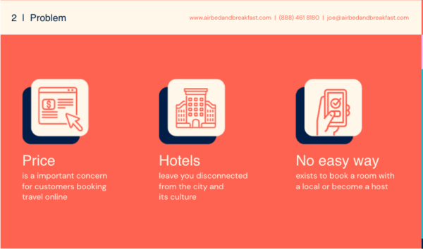
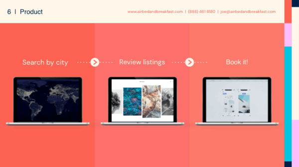
- Airbnb: Opened with a memorable problem, showed traction, and visually mapped the opportunity. Why is this pitch special? Well…
“Using this pitch, founders Brian Chesky, Joe Gebbia, and Nathan Blecharczyk successfully raised $600K from Sequoia Capital and Y Ventures. Since then, Airbnb has evolved into a powerhouse in the travel industry, reaching a valuation of 20%+ market share in the vacation and rental industry.” – Clustox
Here are some of their best slides:


- Dropbox: Used simple, clear visuals to explain a complex product.


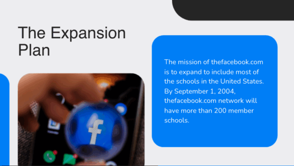
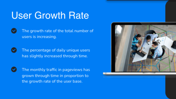
- Facebook: Focused on user growth and network effects.

Takeaway:
These decks win because they’re clear, focused, and audience-driven—not because they use all the bells and whistles.
Deck Writing Is Business Storytelling
Deck writing isn’t just about filling out templates or picking nice fonts. It’s about turning your vision into a story that moves people—whether they’re investors, customers, or colleagues. The best decks blend clarity, smart design, and authentic narrative, making complex ideas easy to grasp and hard to forget.
Templates, tools, and AI make deck building easier, but the real impact comes when you shape your slides with your unique perspective and tailor your story to your audience. A standout deck isn’t just polished—it’s focused and memorable.
So next time you build a deck, treat it as a creative act. Know your audience, sharpen your message, and use every slide to build momentum. That’s how decks open doors, win deals, and drive real change.
Frequently Asked Questions (FAQs)
How long should a deck be?
A: Aim for 10–15 slides, but let your story dictate the length – not the template.
How do I adapt a deck for investors vs. clients?
A: Understand what your audience wants. Investors want traction, market size, and business model. Clients want to see their problem solved and clear ROI.
What’s the best way to open or close a deck?
A: Open with a hook (story, startling stat, or visual). Close with a clear ask or next step.
Can AI tools replace human deck writers?
A: AI like Aurora Slides can accelerate and enhance your process, but human judgment, empathy, and creativity are irreplaceable.
How do I avoid copyright issues with images?
A: Use royalty-free sources like: Unsplash, Pexels or Pixabay. Create your own visuals, license images properly, or even better; get permission to use them.
How do I improve my deck writing skills?
A: Practice! You will get better the more you do it. Look at other iconic decks available online like the examples we showed in this blog that have proven being effective. Also skim through our blog talking about Best Investment Deck AI Generator to learn about more AI options you could be taking advantage of if you are at a very beginner level.